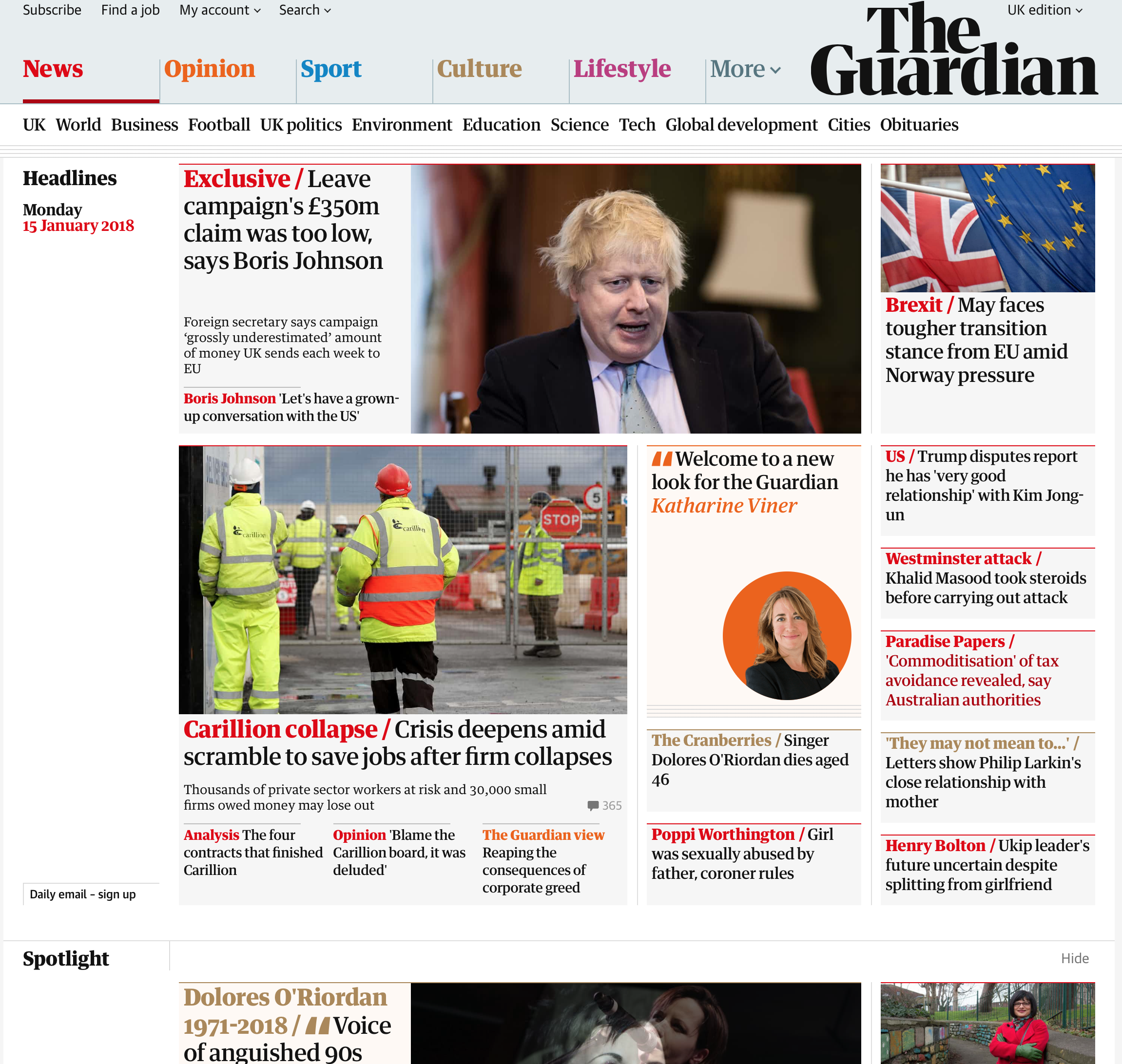
This morning, The Guardian, the UK based newspaper, revealed a new design for their website and mobile apps, in conjunction with their release of their newspaper in a tabloid format, instead of the original broadsheet. Naturally, the design decisions of the team at the Guardian have been analysed, over and over, throughout the day by designers and readers alike, giving their opinions about whether they think the new look is good or bad.
I’ll be first to admit, I’m a fan of The Guardian. I think it’s a very good newspaper, and has a range of differing views, with editorials provided by a range of voices, from the in-house staff, through to famous faces such as Bernie Sanders, Tony Blair, David Cameron, Theresa May and Naomi Klein, to name but a few. Their excellent work on exposes such as the Snowden documents, and the Panama and Paradise papers, justifies the subscription money alone. I don’t always agree with everything they publish, but I think that’s a good thing, as I think this helps the readership consider things from outside the traditional leftist standpoint from which the paper traditionally hails.
Content aside, what about the new design? I do think it does have its flaws. Much of the previous considerations to whitespace have gone, leaving some rather uncomfortably small gaps between items such as the main photo in a story page and the content below. The choice of the font, whilst bold (pardon the pun), does close up a little at smaller sizes and make reading difficult, especially on smaller screens or in less than optimal reading conditions. The four lines motif, indicating further reading behind the page you’re on does hearken back to a degree of skeuomorphism, and the redesign doesn’t seem to incorporate legacy items which haven’t been changed over, thereby giving an uncomfortable look of being half-finished.
However, I will say this – I don’t necessarily think that all of these things amount to something bad as a whole. It’s still distinct in its design, and presents a fairly good reading experience in the end. Before entirely condemning it, I would be interested to see what work has been done, behind the scenes, to come to these design decisions, in the hope that these are elements which can be worked upon iteratively in the future. Unlike its hardcopy counterpart, the website and mobile apps can change over time, and I hope that The Guardian take on the feedback to improve upon their first version, to make an even better experience in the near future. I look forward to watching that come into being.